

University DigiMap
Summary
Tasked with designing a product that enables wheelchair-using students to experience university life like any other student, I investigated the primary stresses of wheelchair users during travel. I designed a digital map app that provides detailed university wayfinding information, to find best routes to get to destination on time and safely. The app allows users to report on hazards in real-time to ensure that travelling on campus is not delayed by unpredictable factors.
Individual project
Year: 2021
Scope: 14 weeks
Category: App & UX Design, Designing for Disability
Skills Used:
-
Sketching, wireframing
-
Photoshop, Illustrator
-
Prototyping
-
JustinMind (UI prototyping software)
Design Brief
The project tasked me with designing an accessible solution for wheelchair-using students on campus. The goal was to create a product that enhances mobility, ensures timely and safe travel, and contributes to a more inclusive university environment. The solution needed to offer a unique Value Proposition by combining accessibility features into a user-oriented, market-differentiated product, while addressing key UNSDG goals.
The Problem
For students reliant on wheelchairs, there are many basic on-campus routines and pedestrian facilities - exploring campus grounds, getting to classes on time, meeting up with friends - that requires a double-layer of planning to accomplish. Not doing so causes a great deal of worry and anxiety for unexpected delays. The current tools available for navigating around Parramatta South campus do not effectively support these needs and concerns.
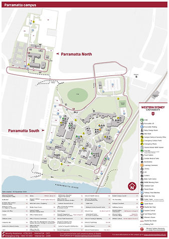

General and Accessibility Maps of Parramatta South Campus, WSU.
The information and details included in each of these 3 maps are completely different and each have its own purpose as indicated by their names. As such, mobility-aid users feel that some information are difficult to locate, and it can be taxing having to plan travel routes with disconnected, static information.


Ideation & Wireframing

Functionality mapping to determine the structure and layout for the app's pages.


Wireframe sketches using the university's existing map icons and colours.
3D Prototype
A cardboard model of a mobile phone and paper screens were created to test the reality of usability. The prototype helped to achieve fluidity in terms of expanding information screens and switching between screens. It also helped with appropriate arrangement of information per screen (i.e headings, location of text, size of text). These are to ensure that mobility aid users need not spend too much time wondering what a button means and how much info there is to read through.


